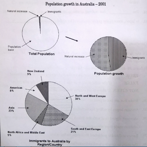
The pie charts Show information in relation to population growth in Australia in 2001.
The top two pie charts Show that there was only a very slight increase in the Australian population in 2001. The increase came fairly equally from both a natural birth increase and immigrants moving to the country with the former being slightly greater than the latter.
The bottom pie chart shows a breakdown of the countries from which the immigrants came. With a contribution of 34%, North and West Europe easily make up the largest portion of immigrants to Australia. The next largest contributors are Asia and South and East Europe - with contributions of 23% and 21% respectively. New Zealand is next making up 9% of the immigration total with the Americas only one percent less in their contribution at 8%. The smallest contribution comes from North African the Middle East with 5%.