IELTS Task 1 : Multiple

  • The demand for electricity in England

    The graph below shows the demand for electricity in England during typical days in autumn and spring. The pie chart shows how electricity is used in an average English home. Summarise the information by selecting and reporting the main features, and make comparation where relevant...

    Dec 10,2018
  • Visits to and from the UK (1969 - 1989)

    The charts below give information about travel to and from the UK, and about the most popular countries for UK residents to visit. Summarise the information by selecting and reporting the main features, and make comparation where relevant...

    Dec 10,2018
  • The types of communication used in 1962 and 1982

    The two pie charts show the types of communication used in 1962 and 1982. Summarise the information by selecting and reporting the main features, and make comparation where relevant...

    Dec 10,2018
  • The types of music albums purchased by people in Britain according to sex and age

    The graphs below show the types of music albums purchased by people in Britain according to sex and age. Summarise the information by selecting and reporting the main features, and make comparation where relevant...

    Dec 10,2018
  • Causes of land degradation by region

    The pie chart below shows the reasons why agricultural land becomes less productive. The table shows how these causes affected three regions of the world during the 1990s. Summarise the information by selecting and reporting the main features, and make comparation where relevant...

    Dec 10,2018
  • Causes of insomnia

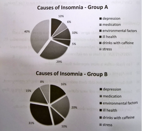
    The pie charts below show the leading causes of insomnia, in percentages, as reported by two groups of people. The people in group A were between the ages of 20 and 40 and those in group B were between 60 and 80. Summarise the information by selecting and reporting the main features, and make compara..

    Dec 08,2018
  • How senior high school students spent their money?

    The charts below show what senior high school students in 3 different high schools (Beaufort, Westmont and Whitford) spent their money on in 2005. Summarise the information by selecting and reporting the main features, and make comparation where relevant...

    Dec 08,2018
  • Protecting the crops from damges (2005)

    The graphs below show how the amount of money spent on protecting crops and how crops are damaged in three different regions of the world in 2005. Summarise the information by selecting and reporting the main features, and make comparation where relevant...

    Dec 08,2018
  • Visitors to Britain (2004-2005)

    The graph and table below show the changes in the number of overseas visitors and top 5 visitor countries to Britain in 2004 and 2005. Summarise the information by selecting and reporting the main features, and make comparation where relevant...

    Dec 08,2018
  • Energy consumption in the UK and USA (in 2000 and 2006)

    The charts below show UK and USA energy consumption in 2000 and 2006. Summarise the information by selecting and reporting the main features, and make comparation where relevant...

    Dec 08,2018
abc