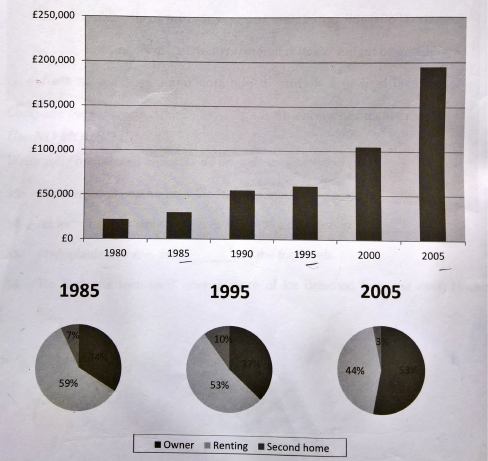
The illustrations given relate to housing costs and accommodation status in Britain. The bar chart has a 25 year range in S yearly increments from 1980; the pie charts cover 3 different years from 1995, also in 5 year periods.
The most striking feature of the bar chart is that the median cost for housing increased more than seven fold over the period given, from approximately £25,000 to just under £200,000. The most dramatic increases were between 1985 and 1990, and again from 2000 to 2005 where the cost of housing almost doubled.
As house prices increased, it is notably that renting a property declined, falling from 5996 down to 4496 by 2005. An inverse correlation can be seen with properties that were owned by the occupants, as this figure increased by nearly 2096. Despite a slight increase between 1995 and 2000, the percentage of houses classed as second homes fell dramatically to less than half of the original 796.