Jackie: I've been trying to book a holiday and I've become very frustrated with some websites and the way they're designed.
Richard: So for this week's podcastsinenglish.com business podcast we're going to look at five key areas that businesses must get right on their websites.
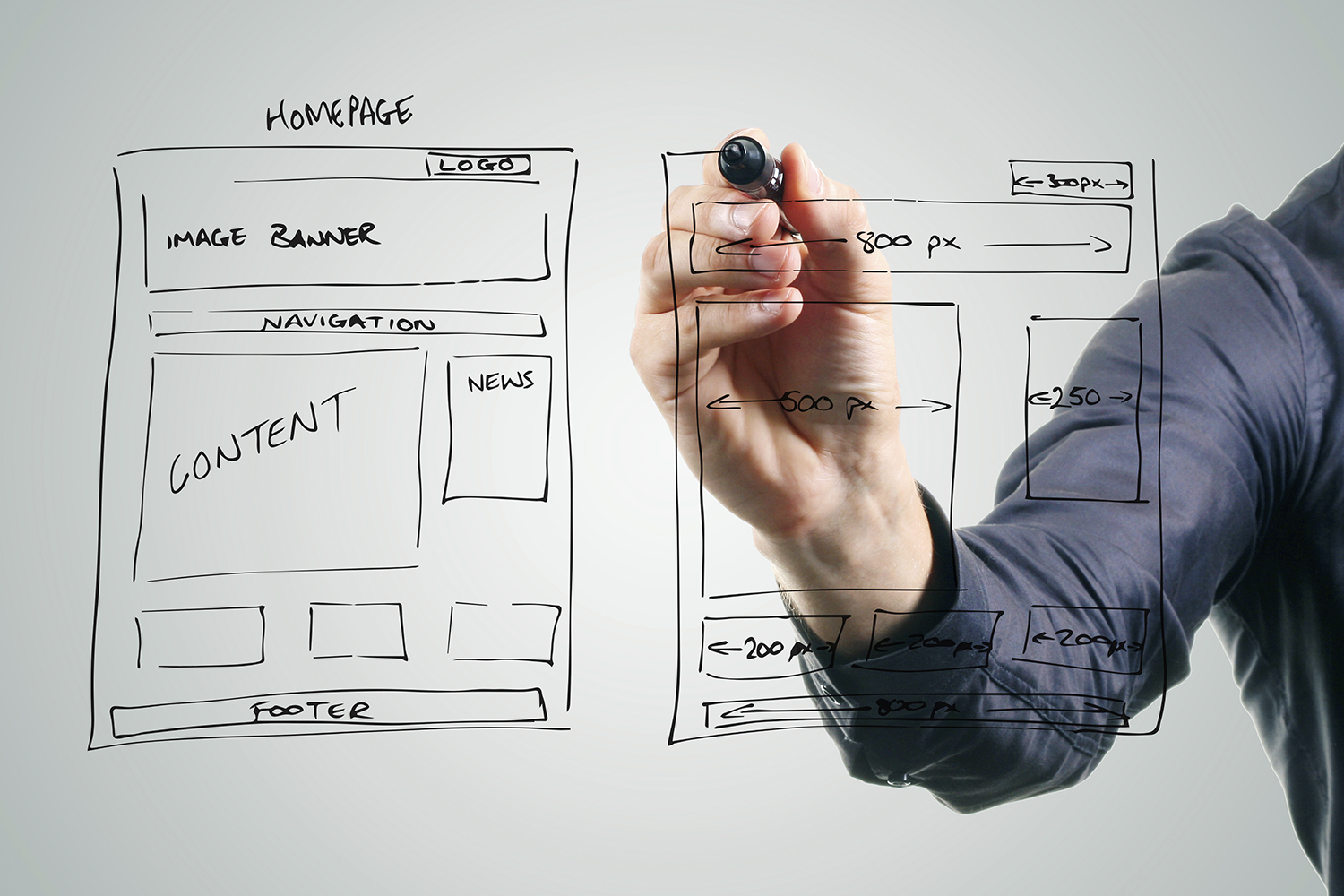
Jackie: The first one we think is the homepage, of course.
Richard: Obviously, yes.
Jackie: You need to know when someone goes on a website, you need to know what the site is, what's it for and who's it for.
Richard: Exactly. But isn't that always obvious?
Jackie: Well, you would think so, Richard, wouldn't you? But I spent quite a few hours on some websites only to discover that the websites were not for EU residents and that wasn't clear at all at the beginning.
Richard: And the other key thing on the home page is that it needs to have the overview of the content of the whole site and that is basically on the navigation bar.
Jackie: So, for example if you are on the BBC website...
Richard: ...It's got, its navigation bar, it's got the news, sport, weather, travel etc.
Jackie: A lot of this vocabulary that we're covering today is on the extra vocabulary worksheet that supports the podcast.
Richard: Yes, there's a lot of specific vocabulary with websites and website design.
Jackie: The second feature that we think is important, linked to the homepage, is the tagline.
Richard: Yes, it's been around for a very, very long time. I always remember the New York Times is very famous for its tagline, “All the news that's fit to print”. And that's come through on websites as well.
Jackie: So basically it's a summary of what the site is about.
Richard: Exactly
Jackie: Yes, and our summary is “The podcast site for learners and teachers of English”.
Richard: Fantastic, sounds good to me. Number three.
Jackie: This seems another very obvious feature, but it's not always the case.
Richard: And that's the ease of use.
Jackie: Yeah. One of the things that's frustrated me, again recently, was that googlemail, Gmail, have recently redesigned how to compose an e- mail and they've made it much more difficult. The website needs to be self-evident, people don't like to think about.. they don't like to puzzle over how to do things; knowing what you can click as well.
Richard: Right, so that's point four, the navigation.
Jackie: And the best navigation tool is the use of tabs, they're very easy to use.
Richard: It needs to be clear for people to see what section they're in and how you leave, yes.
Jackie: But there is for our fifth point something which is not really recommended but is still quite popular.
Richard: And that's pulldown menus, or drop down menus.
Jackie: So this is when you, your cursor goes on a...
Richard: You hover over a...
Jackie: Or you can click a tab.
Richard: Yes
Jackie: And then a list suddenly appears, doesn't it?
Richard: And then you go down the list and then you click an item on that list and that takes you to another page.
Jackie: I don't know about you, Richard, but sometimes you go onto those drop down menus and then it leads into another one and then if you move your cursor off it you've lost, you've lost where you're going.
Richard: Exactly and you have to start again. A real pain.
Jackie: They can be very tricky. So we've covered five main areas but overall the most important thing is that, for... when people use a website they don't need to think too much about how to use it.
Richard: It needs to be intuitive.
Jackie: User-friendly
Richard: Exactly
Jackie: That would save me a lot of hours [Jackie laughs]
Richard: Well, let's hope you get that holiday booked.